Upstairs Downstairs: From Intensity to Entitlement
Separating out the wrist-strain of typewriter-hewn typographic constructions from more recent wheel-mouse conceptualism, Keston Sutherland navigates the textual corridors and dead ends of Poor. Old. Tired. Horse. at the ICA
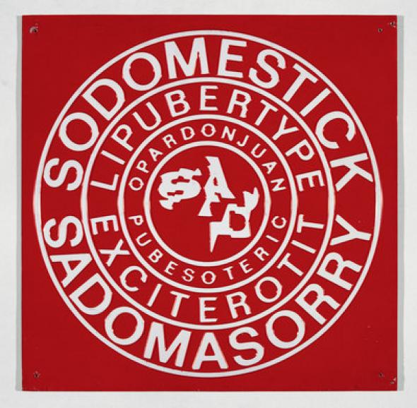
Poor. Old. Tired. Horse. is an exhibition, says the first wall, ‘of art that verges on poetry’. Some of it, from early on in the history sample downstairs, is ‘Concrete Poetry’ proper in the tradition whose major British figure is Ian Hamilton Finlay; some of it, from upstairs and later on, more indeterminately ‘explored the intersection of the graphic and the poetic.’ The exhibition makes or reduplicates two claims. First, that poetry can interestingly be verged on by art, and second, that the impulse and inquiry of Concrete Poetry, a distinct movement of the 1950s and 1960s with its roots in Apollinaire and Tzara, have been in some measure kept alive and carried further by younger artists whose work includes typography. A third claim is twisted through the exhibits, not by their curation simply but by their contiguity in argument and rhetoric, namely that language is essentially a material phenomenon, best handled in blocks and plates, inks and banners, anything you can nail up, spray on or push into a pliant surface, and that ‘poetic’ language must be the best region of all in which to show the workings of this claim, since it is on behalf of poetry that the fallacy of immaterial language has been most elaborately cooked up and blindly swallowed over the past three or thirty hundred years. That last claim is now such a widespread and influential one that it could surprise only the direct genetic descendants of Shelley, and then only if it was screamed at them in Swahili by Mont Blanc. But widespread or narrow, the claim bears re-examining, particularly when, as on the stairs between the levels of this exhibition, the force of it seems again newly undecided.
Stupidity,’ wrote Ian Hamilton Finlay, ‘reduces language to words.’ Sagacity on the other hand knows that language is also grammar and syntax, serifs, bowls, ascenders, meanlines and x-heights, colons, dashes and diacritics, the whole complex typeface anatomy and its material context of manufacture and placement. By the time we get up the ladder to ‘poetic’ language, we’re dealing not just with the sum of these material elements, but with the disintegration and dialectical mishandling of them, their recombination in forms whose uncertain legibility depends on insight into the improvised relations between freely conversible bits of print kit. Graphic language on this account is like graphic violence: not just language, but gratuitous language, language in your face, langage pour langage.
The most extreme and also the best examples in the exhibition of language in this enlarged sense, language really haywire, fissiparous and reinvented, are probably the long scrolls of typewriter art by Christopher Knowles from 1980. You can’t look at them without the wall telling you that Knowles is autistic, an opportunistic flag-up that sets the tone for what the curators presumably want to be an amateur psychological encounter with his work. But the note on the wall doesn’t get in the way too much, because Knowles’ typescripts are powerfully enough engaging to tear attention away from the words that package them. They’re three skinny panels, typewriter inks on white paper, the paper rippling slightly from age, loose against the wall, the red and black ink bleeding slightly from its shallow impression into the sheets but the bleed managed and not contrived, a simple expense of ink not exploited for concepts. The panels look like fantasies of primitive computer games, mixes of invader information and invader pattern scrolling downward to be blasted by whoever you play at the bottom. Lists of names are fixated into rectilinear arabesques: from nowhere a load of Beatles songs, one above the other. It’s weirdo obsessive specificity, the sort of beyond anal hoarding that you get in some late poems by John Wieners but with much more conscious and meticulous design. In fact, not a single one of the thousands of typed characters is corrected: the panels are lucid nightmares of precision, graphemes set up like dominoes on a waterbed. Knowles’ talent with the machine is intense to acknowledge. Tricky manual work, easy to fuck up at any moment, in which any single fuck up would mean starting again from the beginning, floats on the wall like a gigantic receipt you’ll have to check in detail. What singles out these panels for me is how much I’m drawn by them into imagining the actuality of their construction, the wrist-cramping work and the trances of pedantry that he must have known he would abandon himself to, the monumental triviality of their manufacture.
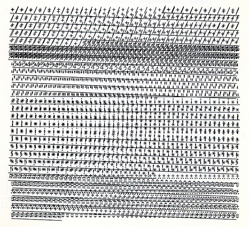
Image: Typewriter poem by Henri Chopin
By comparison, the still more minutely pored-over and mathematically exact, but much smaller sheets by Dom Sylvester Houédard from 1966-71 seem like feuilletons, beautiful but done in leisure and without any homage to derangement. His work and Henri Chopin’s are both virtuosic, hallucinatory experiments in what can be done with typewriters, verging on optical illusions in Chopin’s case. They’re patient where Knowles’ are compulsive, diagrammatic where Knowles’ are narrowly sprawling. In the same room the cones by Lilian Lijn spin round in a steady drone. Letraset on painted cork, motorised turntables: not now bedroom or garage art production values but the better equipped ingenuities of the atelier. The largest of them, Poemkon=D=4=Open=Apollinaire, 1968, fills the room with uninterrupted noise, gratingly, as I thought, and almost in an unconscious satire against its own recycling of concepts. Nothing in the language on the cone is interesting in itself, but its adhesion to the cone, like an aphasic’s fridge magnets, is quite striking. You want the language to run through your fingers, like you want to stick your fingers into a desk fan, to see if it will stop or if you’ll have done something very stupid (but of course the bored guard is half-watching). Admirers of Kenneth Goldsmith’s Day, 2003, his complete and unabridged transcription of an edition of the New York Times, may be relieved to find its time-saving prolepsis on the wall across from Lijn’s cone in the few panels from Vito Acconci’s Four Book, 1968, which show columns from the New York phone book alongside columns of untethered linguistic driftwood. Acconci looks for a dialectic (semantic thinning v. unreadable information overload) where Goldsmith decides there is the sublime (one block indivisible under capital); the art-gestures that deliver these different concepts seem similarly beholden to the nutshell, but Acconci’s can at least be read.
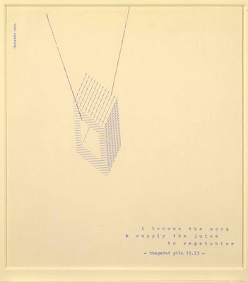
Image: Dom Sylvester Houedard, I BECOME THE MOON AND SUPPLY THE JUICE TO VEGETABLES, 1970
Upstairs the activity shifts, and Concrete Poetry goes out the window. On the left, Guston and Smithson, Coolidge and Hockney; on the right, ‘younger’ professional artists. Guston’s pictures include language by Clark Coolidge, the US poet who is usually called a Language poet but isn’t one. Eight drawings from c. 1972, done in ink on paper, not Guston’s more infamous blancmange of oils. Like the paintings, the drawings open on a cosmos of lumps and parts, the escaped prop cupboard of Guston’s confessional diegesis: castrated stumps, eyeballs in profile, rocks like blobs, lazy dashes and scribbled shadows, sausagemeat fingers pointing out. All this clashes interestingly enough with the aleatory, abstract sententicules by Coolidge, who is probably now the most respected or fashionable poet in the exhibition, making an odd sort of cartoon harmony. Some of the text has been Tipp-Ex’d: a neat trick missed by the other artists. The text in these pictures is like a caption or tag, they verge on the graphic novel. They are not Concrete Poetry nor in any way continuous with the spirit of it, which was the spirit of a mechanic and not the spirit of New York expressionism. The rest of this left hand room is even further from the stuff downstairs, and the David Hockneys, though pretty enough, don’t seem to belong in the show at all.
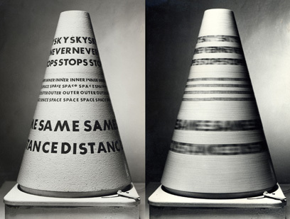
Image: Lilian Lijn, Sky Never Stops, 1965
The argument of the exhibition is in the last room, if anywhere. Has there really been a continuous practice and theory of graphic language, an effort of experiment and artifice running from Finlay and Houédard to the present day, and is it in work by Frances Stark, Sue Tompkins and Anna Barham that we should be looking for it? I think the answer to the first part of that question is yes, and to the second part, no. As Chris Goode has already noted in his excellent review of the show on his blog, Thompson’s Bank of Communicable Desire [http://beescope.blogspot.com/ ], the line goes more obviously into Bob Cobbing – and, we might add, from him forward and sideways into Mike Basinski, Lawrence Upton and, in a different vein, Sean Bonney than into the work to which the last word in Poor. Old. Tired. Horse. is given over. Anna Barham’s video piece is momentarily captivating, but better conceived than watched. The language it produces is the least interesting of any in the show, though presumably it doesn’t mean to be interesting, exactly, but only hypnotic. It reads like an inadvertent joke about modernist hostility to narcotic versification, an invitation to the trance that leaves you with a lightly tingling appetite for ketamine. Sue Tompkins’ twenty sheets of pale blue A4, gummed to the wall in rows, put up with little bits of language culled from use, strewn on them in a string that doesn’t quite amount to a sequence. One of the pages is upside down on the wall, a mistake that it was possible to make because it presents nothing but a single ‘N’ in its exact centre. An easy mistake, maybe, but one that surely suggests something about the degree of care shown for this work by its curators, and presumably the degree of care they expect its viewers will show for it, too (if it’s not a mistake, there’s no obvious reason to care that it isn’t). Matthew Brannon, who ‘explores the potential of words to communicate, illustrate, misrepresent and confound,’ according to the exhibition catalogue, has made some very ordinary jokes about print and type quality, with perfectly reproduced pictures of typewriters floating over little bits of language that look like typewriter fonts but are actually more sophisticated. They’re locked behind glass (presumably an insurance requirement).
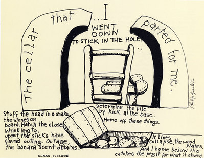
Image: Philip Guston, The Cellar, 1972
Frances Stark’s big works look almost as though they could be the covers for the next few Radiohead albums. The worst of them is The Quantity of Effect, 1997. The title runs downward in a chunk of egregiously authentic typewriter print, a brown and black stripe of text in the bottom right corner of an otherwise blank white page. It takes the obsessive, mechanic, labour-intensive materialism of the earlier stuff downstairs and seals it under the varnish of one-ply conceptuality. The typewriter is no longer a cathected object, minutely exploited, probed into, ransacked and recalibrated, ironised and détourned, but just a sign for anachronistic textual materiality, reproducible like a digital font or stencil-text in a studio. What’s lost in this newer work is the joy in the materials of production that distinguishes Knowles and Chopin and Finlay. Younger artists ‘exploring [that verb is always an alibi] the intersection of the graphic and the poetic’ just get what they want. If they want a typewriter font, they get it, if they want paper to be visibly pressed in by ink, they get it, if they want paper to be unimpressed Xerox paper, they get that: the wild range of language-looks in the work downstairs, from scrappy to clinical, obsessive to olympian, the whole erotics of activity and experiment, has become upstairs a simple range of options, bland and bloodless, none more labour intensive than any other, each one reducible to the sign it’s made for. That’s not, I hope, a reactionary disinterest in new work, nor an insensitivity to complex irony (the irony is not complex, and the work is not new). It’s an objection to an aesthetic of entitlement. Even now in our twilit avant garde of the deskilled there is intense work going on to rip new possibilities from language with a force as original as Finlay’s, or more original yet; but it’s being done by literate, obsessive artists in language whose art is not content merely to verge on anything, least of all poetry.
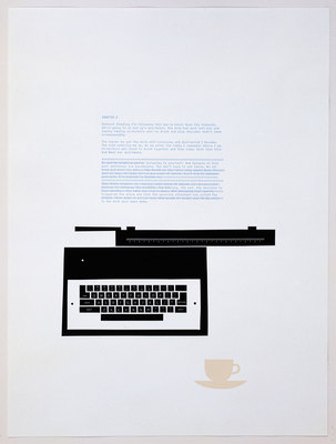
Image: Matthew Brannon, Words on a Page, 2008
Info
Poor. Old. Tired. Horse. was held at the ICA, London 17 June - 23 August 2009
Keston Sutherland <keston AT fea.st> is the author of Stress Position, Hot White Andy, Neocosis and other books, the editor of Quid and Barque Press (www.barquepress.com ), and a lecturer in English at the University of Sussex
Mute Books Orders
For Mute Books distribution contact Anagram Books
contact@anagrambooks.com
For online purchases visit anagrambooks.com


