Uncomfortable Choices
Should net art strike up critical postures vis à vis the institutions which house it? Anathema, thinks Simon Patterson; essential, counters the artist known as ‘Harwood’. Pondering the work of both on the Tate website, Dr. Future knows which he prefers.
The first two internet art commissions on the Tate Gallery’s website, displayed side by side, seem to be inviting the viewer to make a choice between two directions for the future. The image on the right, a plain red rectangle representing Simon Patterson’s Le Match des Couleurs, looks like a door into some distant, erudite, conceptual space. The rectangle on the left, by contrast, contains a life size intrusion of dirty brush strokes and the curdled fragments of cultural history. This is ‘Harwood’s Uncomfortable Proximity.
Patterson’s multimedia work presents the Tate visitor with a grid of Pantone colours matched with French football teams, each one varying according to results relayed by Radio France 1. But whereas this piece plays with the spurious remapping of information to create a new system of internal references, turning culture outside-in, Harwood’s Uncomfortable Proximity remaps the iconography of the Tate Gallery’s contents to look outwards to the concrete social forces that created this institution from the social unrest of the nineteenth century, turning the Tate’s collection inside-out.
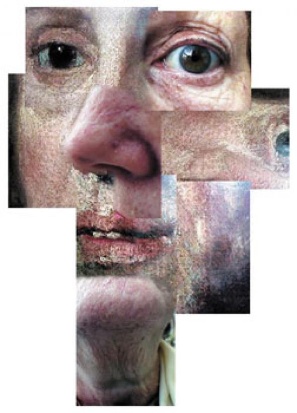
Uncomfortable Proximity is a copy of the Tate’s official website that replaces the Tate gallery guide with a political history of the art museum as an instrument of social engineering. Producing a richer meaning of the Tate’s artworks by making them appear riddled with historical and personal conflicts, this fills in the ‘broken links’ left by official accounts of the role of high art in society, foregrounding how it was conscripted to subdue social strife by inculcating pacifying cultural values. The Tate Gallery’s artworks have here been replaced by montages of Turners, Gainsboroughs and Hogarths into which have been added images of Victorian slaves, prisoners and rioters (played out by the artist’s own family and friends). These uneasy actors from the Tate’s ancestry are fused together by the mud and effluent that originally flowed down into the Thames from the gigantic nineteenth century Millbank prison that stood on the site of Tate Britain.
In the final version the bogus Tate gallery banners were stamped ‘Mongrel’ to clearly distinguish them from the real thing and Tate programme director Sandy Nairne inserted a little introduction into the work itself to make doubly sure people wouldn’t get too confused. But the initial intention to allow the work to automatically launch in a separate browser window behind the official Tate home page places the Tate ahead of its international brethren like MOMA and the Pompidou in the audacity stakes. This, paradoxically, will give it a superior cultural credibility with which to enter the new online art market now being created and which will form the next chapter in the social function of high art.
Meanwhile the red box of Le Match des Couleurs blends in perfectly with the Tate website’s monochrome décor to produce the seamless countenance of Britart cultural unity. It now remains to be seen whether future digital artists will chose to fit snugly into this framework provided for them by the art museums’ nineteenth century agenda or reveal the ‘Uncomfortable Proximity’ of the social conflicts that are its legacy.
Dr. Future <richard AT dig-lgu.demon.co.uk>
Mute Books Orders
For Mute Books distribution contact Anagram Books
contact@anagrambooks.com
For online purchases visit anagrambooks.com


